Colour psychology: what is it?
Emily Kirkham | 07 May 2024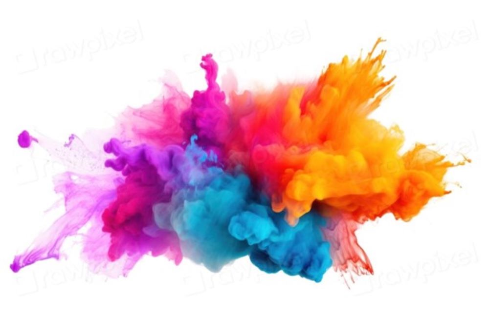
Colour psychology and the meaning of colour is quite often misunderstood and underappreciated in its value and the power it has over our physical and mental wellbeing.
Colour is light hitting our eyes in different wavelengths. When light hits the eye it’s converted into electrical impulses that move around our bodies and through the same part of our brain that processes emotions. Research has shown that colour and its varying tones have a phycological impact on us whether we realise it or not.
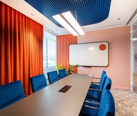
For example, we feel calm within nature from the earthy tones to the rich greens, this translated into an interior setting helps us relax and unwind. When we see bright yellows, we think of energy from the sun’s rays, positivity and happiness. Or when put into a vibrant red room, we can feel either anxiety and frustration or high energy and focus.
When choosing colour for the spaces we inhabit and design for, it’s important to think about what behaviours and emotions we want to promote. The tone and proportion of colour is fundamental to creating a functional space.
The Psychological Primary colours
Reds, Yellow, Greens & Blues are the psychological primaries that affect us all, with each one having different triggers for behaviours. This, along with its chromatic intensity, determines if a colour is soothing or stimulating. Below is a brief overview of colour meaning and their triggers.
Green: The colour of harmony and balance within us, it’s in the middle of the red & blue traits which are intellect and physicality. Green has a medium wavelength and sits in the middle of the colour spectrum, meaning our eyes need no adjustment when viewing it which is why it’s a restful and restorative colour. If used too much within a space however, it can lead to stagnation and boredom.
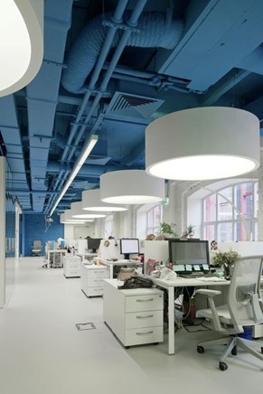
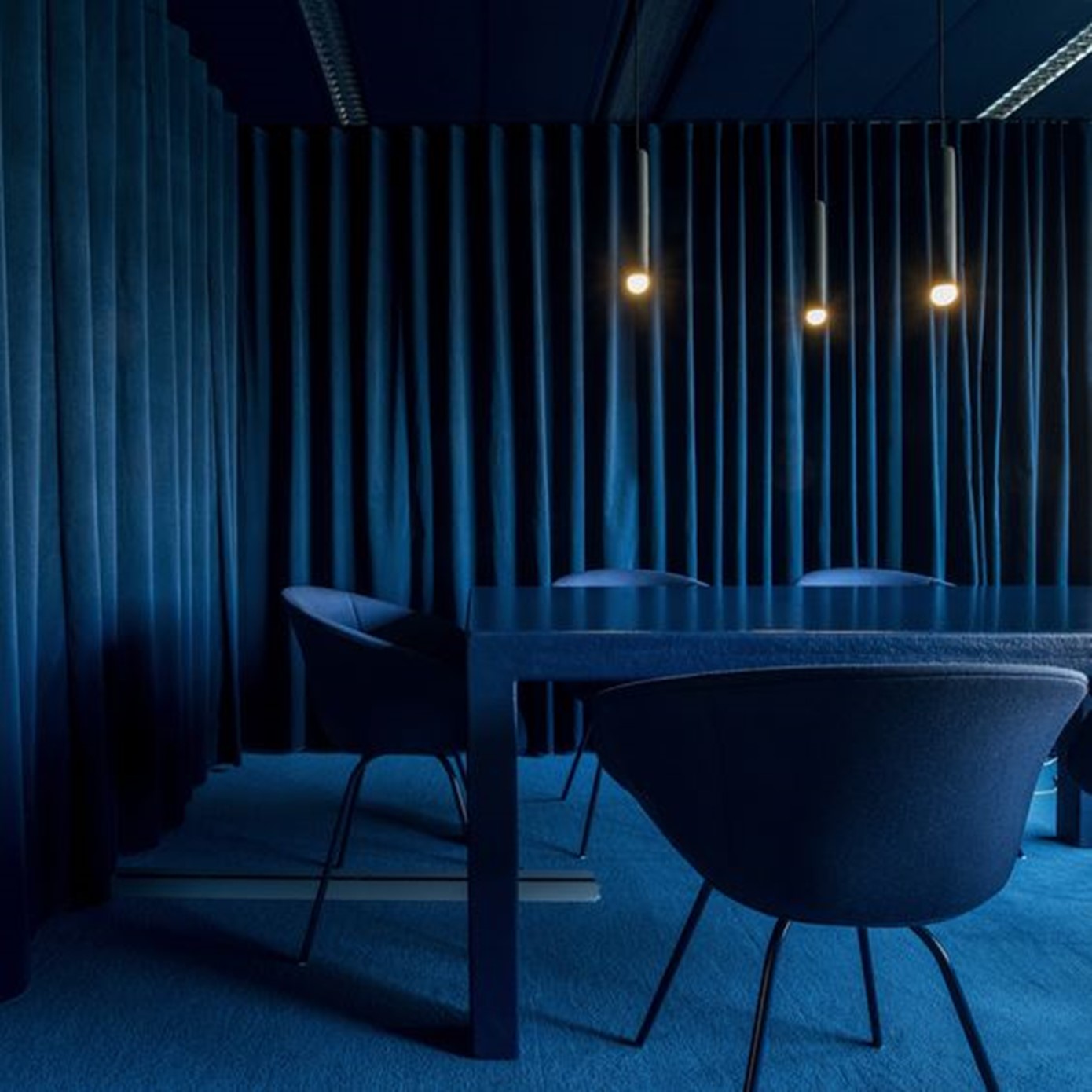
Blue: A colour of intellect and trust, blue triggers us mentally and is associated with calm, reflection and logic. Blue is one of the shortest wavelengths next to violet, a version of blue, which is often attributed with serenity and that of a higher power as it’s the last colour we see on the spectrum.
Yellow: A high wavelength, it’s the colour that triggers the most emotional response from us and is said to be the strongest in psychological terms. It’s the colour of happiness and confidence. However, used too much or in the wrong shades it can lead to irritation and anxiety.
Red: The longest in wavelengths, we see this colour first which can make things appear closer than they seem. Reds evoke a physical emotion that can trigger a fight or flight response, it can make us more energetic and excitable and even elevates our heart rate. Surrounding yourself by too much red however can be perceived as aggressive, confrontational and easily spur the feeling of annoyance. Red in situ can either make us feel uneasy or energised.
When using colour, it’s important to remember the adverse effects that they can have. Too much of a colour can have negative impacts but in the right setting, can work wonders. For example, Blue is a trustworthy & intellectual colour as previously mentioned, a deep blue within a focus room or study space will stimulate the brain and help the user concentrate and remain focused for a prolonged period of time, whereas if we used a lighter shade of blue or the wrong tone, it could come across as cold and uncaring.
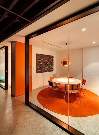
Varying shades of colours each have their own psychological impacts blended from the associated primary: orange, blended from red and yellow is the colour of creativity and playfulness whereas pinks, a shade of red, symbolises love, comfort and nurturing.
It’s all about balance and the understanding of placements. This is why it’s particularly important to sit with clients and listen to what they need, how they want to elevate their space and what message they want to convey.
Next time you’re in an interior setting, be that an office, restaurant or bar, take note of the colours, tones and overall placements of materials and see how it makes you feel when inside. This can spark an interesting debate for you or your colleagues on how you approach aspects of personal and professional life.
Related articles
Northern Group embarks on Yorkshire expansion with deal for Leeds site
29 October 2025Multi-disciplinary property consultancy, OBI, has acquired a Grade II-listed mixed use building, Sovereign House, in Leeds, on behalf of Manchester-based property management and development group, Northern Group. Located in the heart of Leeds city centre, Sovereign House offers 20,574 sq ft of Grade A office space across four floors, as well as 15,887 sq ft […]

JD Fashion completes on sale of Walton Summit Centre unit
22 October 2025Multi-disciplinary property consultancy, OBI, has announced the sale of a 28,544 sq ft industrial unit on behalf of fashion giants, JD. The semi-detached unit is prominently situated at the Preston-based Walton Summit Centre, one of central Lancashire’s premier business parks. Located on 171 Brierley Road, the unit has been sold to Woodside Logistics Group, for […]

Law firm expands in Manchester with deal for more space in landmark building
26 August 2025A full-service law firm has expanded in Manchester by almost doubling its space at a prominent building in Spinningfields. Browne Jacobson has agreed a deal with Schroders Capital, the $111bn private markets business of Schroders, to expand at No.1 Spinningfields. The firm has committed to an additional 4,642 sq ft of office space, almost doubling […]