A Sweet Influence
Alister Shapley | 31 January 2024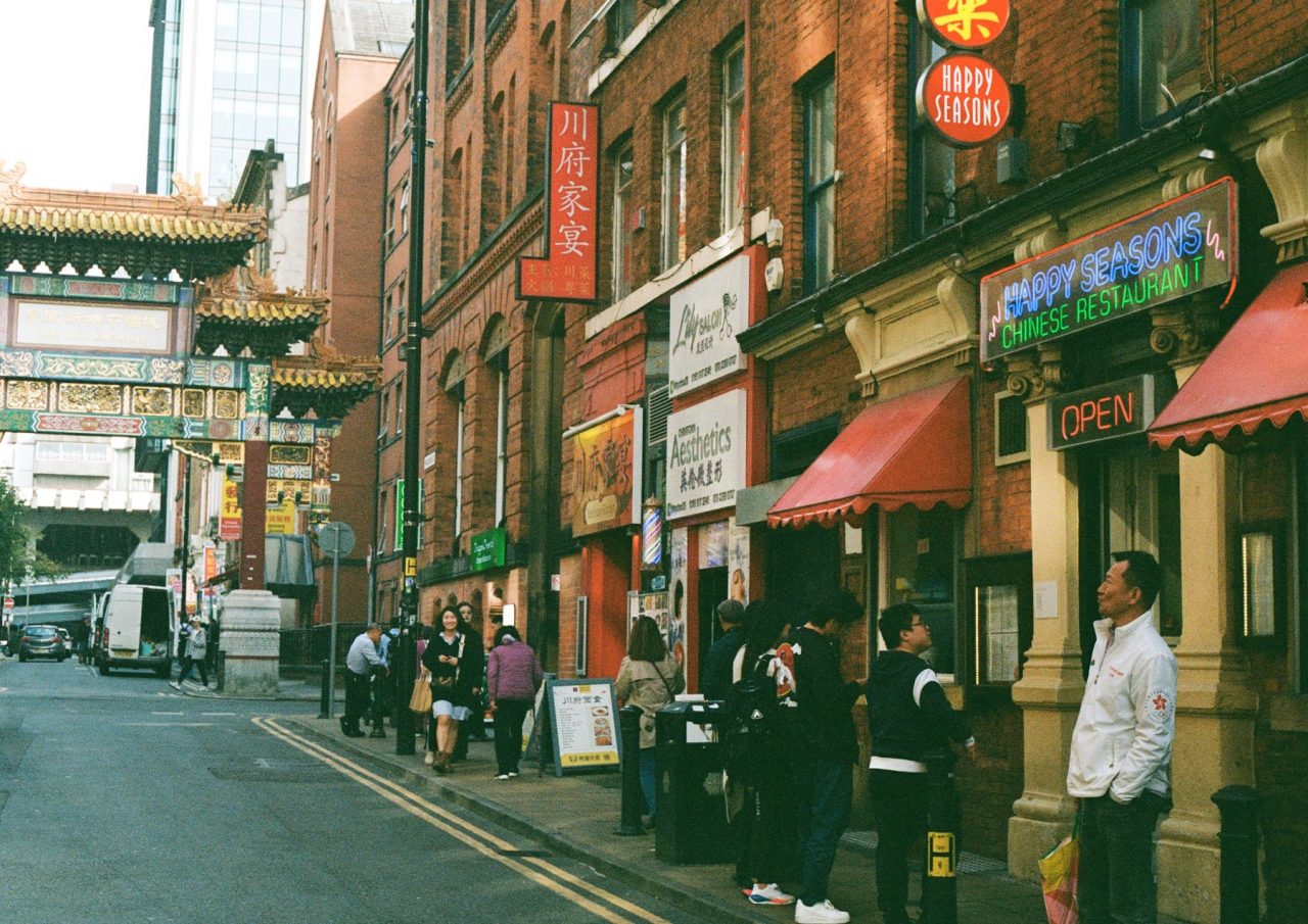
“I enter a building, see a room, and — in the fraction of a second — have this feeling about it.”
Peter Zumthor, Atmospheres
This subject has been discussed many times and from many different standpoints; from architects such as Peter Zumthor to writers like John Berger and typographers like Sarah Hyndman. It is well known that materiality and volume generate a mood as well as visual language. A mood isn’t static; it’s malleable. Similar to the way in which our minds connect to memories, spatial moods are affected by the world around us. The marks that life leaves give a space weight and reason, and typography can also influence this.
In Sarah Hyndman’s TEDx talk, “Wake up and smell the fonts”, she discusses the way in which sweet wrappers visually describe the experience she will encounter when she starts eating. We’ve all had similar experiences as a child in sweetshops or newsagents. Shops which could be classed as mundane are transformed by the joy and excitement of the wrappers’ typography. This effect can be both a blessing and a curse.
Space can also affect typography. Sci-fi has some fantastic examples of this. One of the most famous is the dense, compact, grotty space of the market scene in ‘Blade Runner’. The neon signs are bright and engaging, but the space that surrounds them lends them to a seedy tone. ‘Lost in Translation’ is another great example of how space and typography can juxtapose to emphasise a mood. ‘Lost in Translation’ uses spatial techniques to express the story of two people lost in an unknown city. As an example of this there is a particular scene where Charlotte (played by Scarlett Johansson) is seen sitting on a windowsill of a dark room gazing down at a city scale so dense of tower blocks it’s almost impossible to pick out the roads. Bright advertising boards expressing the fast pace “buy it now culture”. The dark and airy space Charlotte takes up feels alien from the rush of the city below giving a sense of confusion and loss.
Time also can transform typography’s relationship with space. This means that the relationship isn’t static, that it has a life. As in architecture, graphic design and typography should focus on longevity rather than pop culture. More and more we see throwaway design, both in graphics and architecture. In her TEDx talk, Sarah Hyndman said:
“Fonts turn words into stories”
I would expand on this by adding that “stories live as spatial mood”. We don’t live in a two-dimensional world. Space has a relationship with our visual language and affects it. The more we explore this relationship, the stronger our visual language will be, the more we have to be careful with our designs.
Related articles

30 years on from the bomb – reflections from OBI
15 June 2026Saturday 15 June 1996 was a momentous day for Manchester. The massive IRA bomb that blasted apart a chunk of the city’s retail core has in the years since been held up as a turning point, something that triggered a regeneration success story that the city just kept building on, and to this day shows […]

Circling Back with Chris Oglesby
05 June 2026What’s your origin story? I was born in Scunthorpe, but the family moved to Altrincham in 1971, when I was four years old, and that’s always given me a real affinity to Altrincham – it’s been very satisfying for us to work there in recent years. I went to school in Cheadle Hulme. Really, I […]

The Wrap: OBI’s Take April 2026
03 June 2026We’re a third of the way through 2026 – here’s what grabbed attention in April. Corporate deal of the month One of our long-standing client’s Clearwater has for a long time been one of Manchester’s biggest hitters in corporate finance advisory, and they’ve got their reward in being snapped up by US investment bank KeyCorp. […]